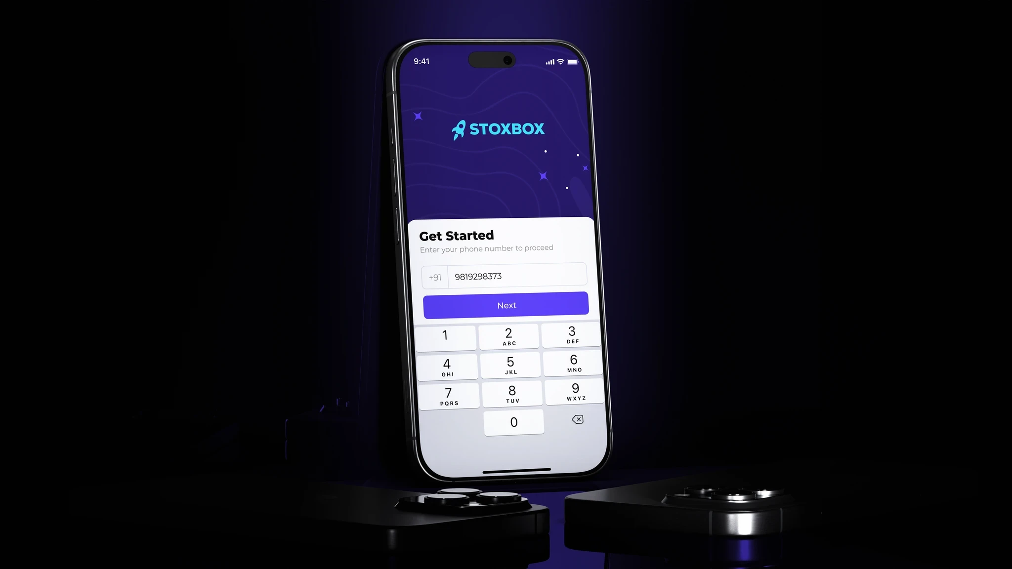

Car rental platforms often suffer from information overload and poor usability. Users are overwhelmed with filters, unclear pricing, and long forms before they even see the cars available. The biggest pain points I identified were: slow decision-making, lack of price transparency, confusing pick-up/drop-off processes, and a poor mobile experience. Swwipy needed to address these issues with a clean, modern interface that made car rentals feel as simple as a swipe.
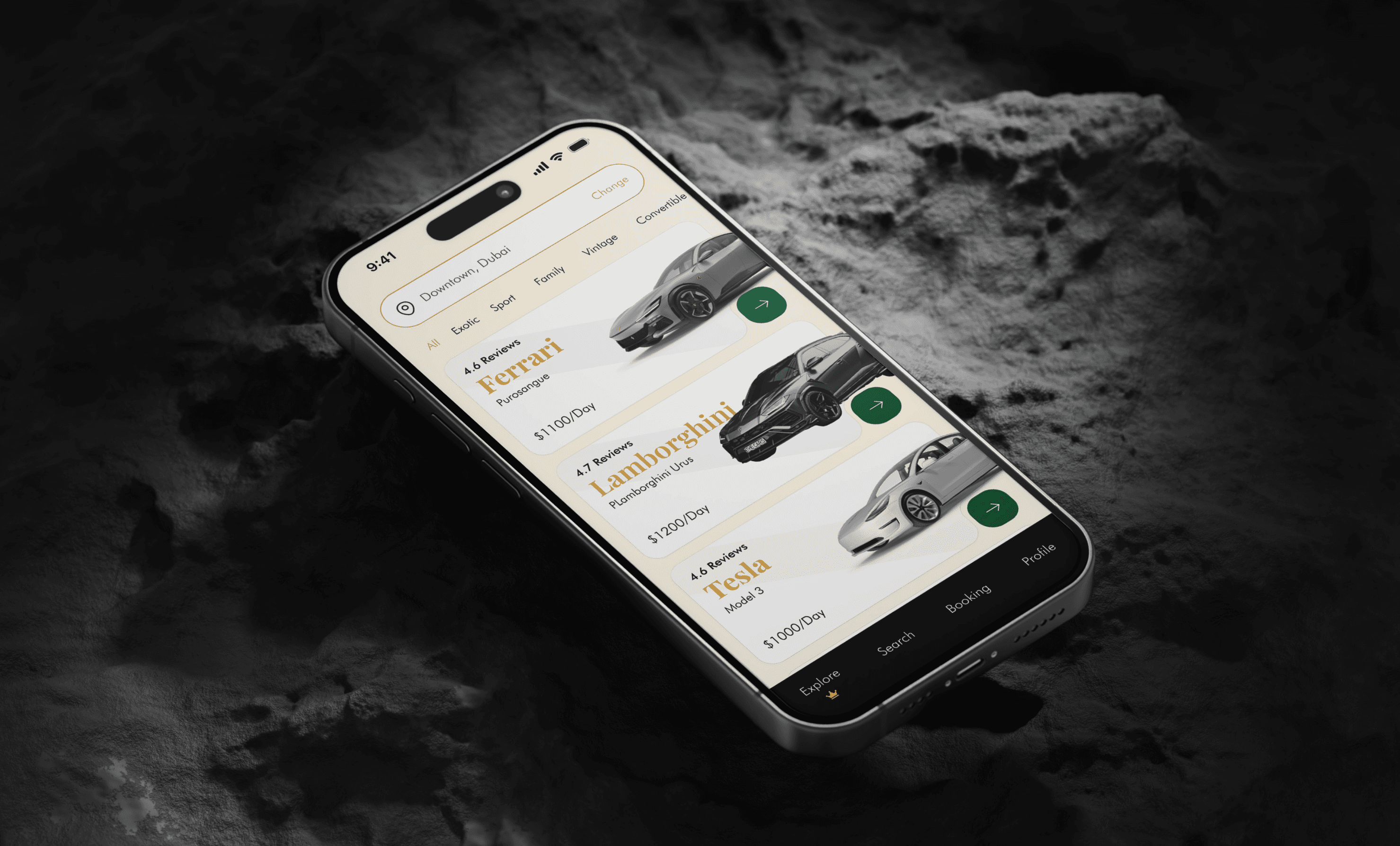
I approached the project by thinking like a traveler with limited time and attention. I prioritized speed, clarity, and mobile-first interactions. The booking flow was reduced to just a few screens—select location and date, view results with real-time pricing, and confirm with one tap. I introduced visual cards for each car, with clear highlights like mileage limits, deposit, fuel policy, and total cost—all upfront. Users could favorite vehicles, compare options, and see full transparency before checkout. The overall aesthetic was minimal and bold, with high readability and intuitive navigation that works just as well on a phone as it does on desktop.
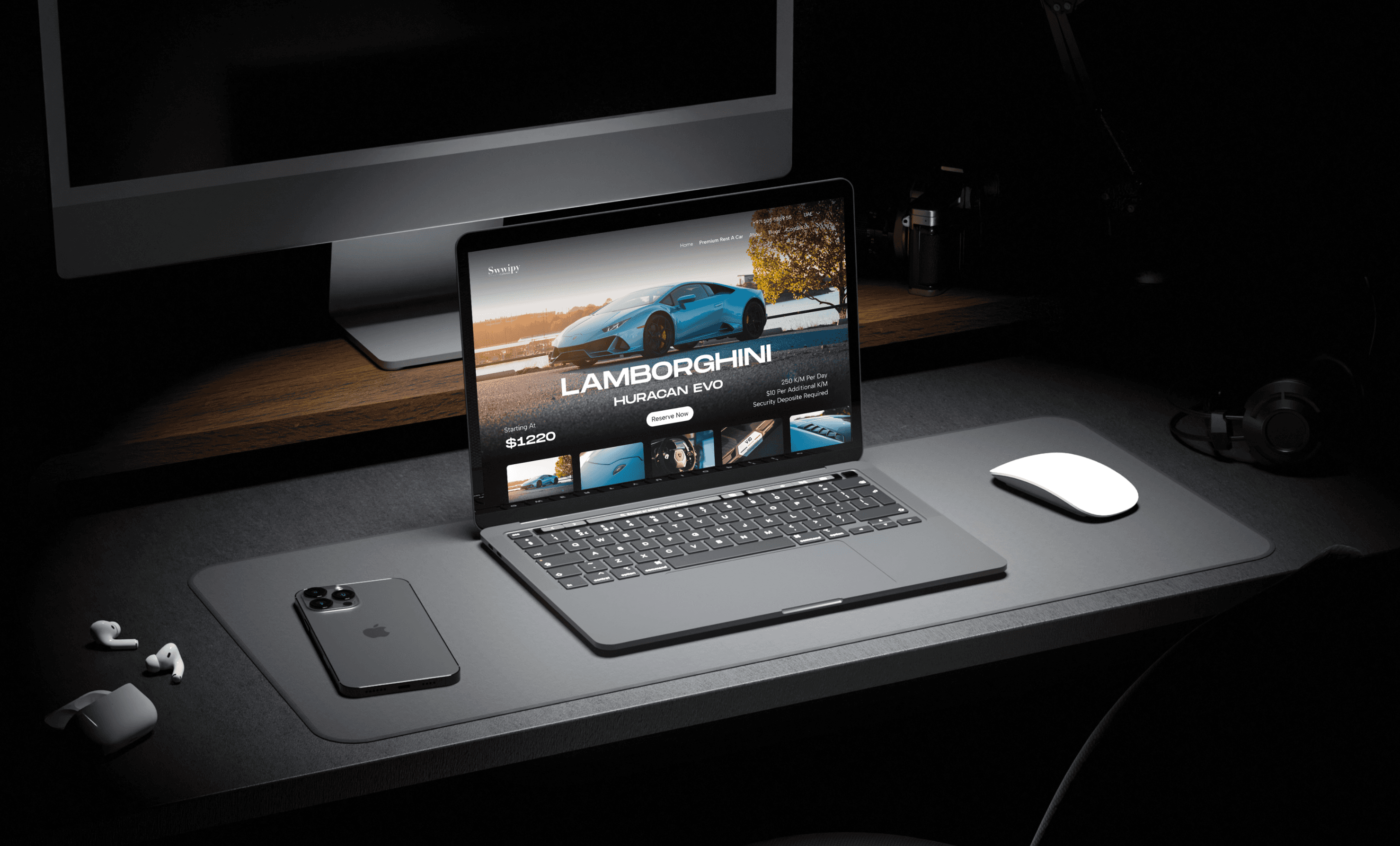


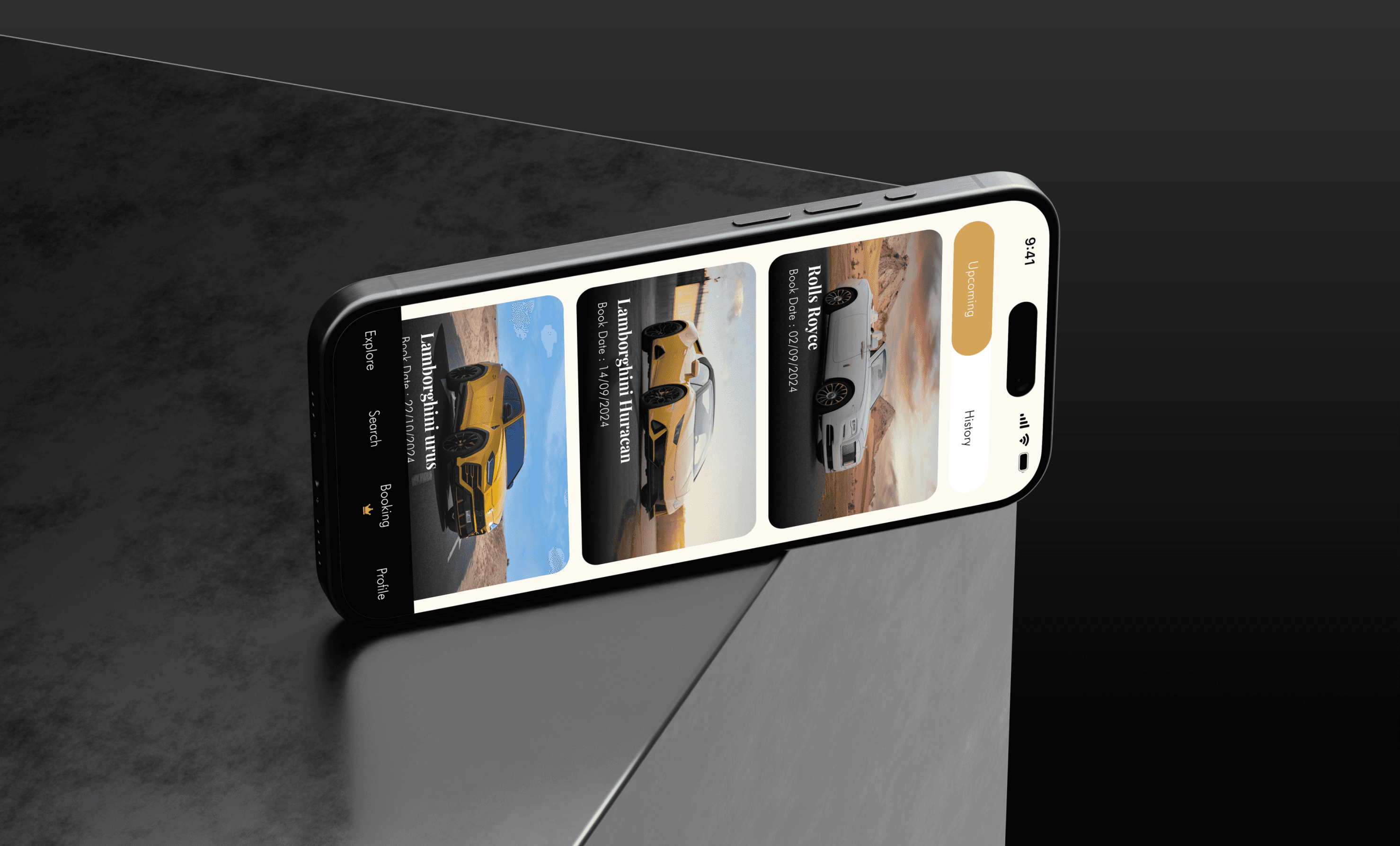
The final design offers a fluid and frustration-free experience, giving users confidence and control from the very first tap. With Swwipy, renting a car feels less like paperwork and more like choosing your ride. The interface encourages trust through transparency, and helps the platform stand out from traditional competitors with an experience that feels truly modern.
Swwipy isn’t just about renting a car—it’s about freedom. Freedom from outdated processes, confusing terms, and slow interfaces. This project allowed me to explore how smart design can transform a legacy industry and bring it into the modern digital age. When you respect the user’s time and needs, the product speaks for itself.
Next projects.
(2016-25©)